All About Paper

I see a lot of questions online about the kind of paper artists use, and what paper is best for a certain medium. So today I thought I’d write a little about how to go about choosing paper for your art. 

I’m no paperologist, so I’m not going to go into too much technical detail here. But there are a few things I want to mention. First off, you want to use paper that is acid-free, as acid in the paper can affect the colours you use and cause them to change over time. Secondly, the weight of the paper is important. The measurement system for this is reasonably complicated, but in general, the higher the weight, the thicker the paper. I like to use heavier weight papers, as they hold more pigment, don’t bend while erasing, and have a more professional feel. 

The paper you choose for your art is going to depend on a number of factors, and I’m going to go through these one by one. 

The four paper colours I use for coloured pencil drawings

Colour

Art paper comes in a lot of different colours, and it’s important to take this into consideration when choosing a paper. For coloured pencil, I use four different colours of paper: white, tan, grey, and black. I use different ones for different subjects, but white is definitely my preference. With pastels, I have a bit more selection, because I’ve ordered multicoloured pads of both Pastelmat and Velour paper. 

Which colour I choose depends on the drawing I’m doing. I think about whether I’m including a background, what the primary colour of the subject is (if it’s warm tones, I’ll choose a similar paper, and same if the subject mainly has cool tones), and what I want the feel of the portrait to be. 

Texture 

Texture in a paper is really important, as it will affect how well your chosen medium works on that paper. When I first started drawing with coloured pencils, I thought a very smooth paper was what I wanted, because I didn’t want any of the paper showing through. It turns out you need some tooth on the paper, to hold the pigment of the pencils and to allow for multiple layers. With pastels, an even greater tooth is helpful, which is why many pastel papers have a rough or sandpaper-like surface. 

Style

Your style is a big factor in which paper you choose. I like my art to be highly detailed and realistic, so I need papers that let me achieve that level of accuracy. I’ve tried some (velour comes to mind) that are not well-suited to my style, and though I have fun experimenting with them, when I’m trying to produce a finished portrait, I just find them frustrating. 

Three different papers, three different textures: Strathmore Coloured Pencil Paper, Velour Paper, and Pastelmat Paper

Preference 

What paper you like best is going to depend on you! Everyone has their own preferences, and that’s okay. I’ve seen beautiful works of art done in coloured pencil on Pastelmat paper, and though I love Pastelmat for my pastels, I haven’t figured out how to use it with coloured pencils. I want to try again, but I did not enjoy it on my first attempt, so I’ll stick with my regular paper for now. 

Cost

This is important for most of us, and it’s hard to justify buying a whole pack of expensive paper just to find out you don’t like it. Some places sell sample packs of paper, which might be worth ordering if you don’t know what type of paper you like. I prefer Strathmore Mixed Media because it’s relatively cheap and easily available. 

My Recommendations

Though I think everyone should explore different surfaces and find what works for them, it is helpful to have specific recommendations from other artists. So here are my favourites: 

Coloured Pencil – Strathmore Mixed Media Vellum Surface

Coloured Pencil – Strathmore Toned Tan

Coloured Pencil – Strathmore Toned Grey 

Coloured Pencil – Fabriano Black Black 

Pastel – Clairefontaine Pastelmat 

I hope that gives you some good things to think about when choosing paper, and if you have any favourites I haven’t mentioned, please share in the comments!

A Fear of Drawing With Colour

One of the things I’ve noticed in my own work is that I tend to desaturate my subjects. By that I mean I make my portraits less vibrant and colourful than the references I’m working from. The reason for this is fairly simple: you can always add more colour, but it’s quite difficult to take away.

Though I still love this portrait, it was my first coloured pencil portrait and I desaturated my poor kitty quite a bit.

The colours I’ve noticed this the most with are reds and oranges, as demonstrated by my portraits of my family cat Blitz I did two years ago. He was a big, fluffy orange tabby, and though I really like my portrait of him, he was certainly more orange than the portrait shows. 

Lately I feel I’ve gotten much better with colour, and I’m not so afraid of adding it to a portrait. One of the main reasons for that is my Bugs and Birthstones series, which was all about colour. While working on that project I was forced to use lots of different colours, and I wanted the gemstones to be a bright and vibrant as possible. So I had to use a lot of colour, and since working on those I’ve noticed I add a lot more colour to my portraits. 

Close-ups of some of my Bugs and Birthstones series, showing the vibrance and colour I used in this series.

Another thing that has helped is looking at other artists’ work online; I tend to like pieces that have deep colours, so that’s what I’ve tried to bring to my own work. Social media is a wonderful place to look at other people’s work and learn what you like about a piece and what you don’t. One of my favourite artists is Paul Hinks – he’s a master of adding rich, vibrant colours to his portraits. Though I’m not there yet with my own work, I’d love to be able to work towards that kind of usage of colour. I think it’s stunning.

The third thing that’s helped me bring more colour into my portraits is practice. I’ve drawn a ton in the last three years, and with that extra practice has come more confidence. I’m now much happier with how I’m using colour in my art, and I’m no longer so afraid to include deep, rich colours in my work. 

Here’s a good example of using colour to your advantage – in Dexter’s beautiful white coat I used lots of shades of blue, purple, pink, yellow and green.

Why is this important? First of all, when you develop your eye, you’ll start to see more and more colours in pictures or live subjects. I remember taking pictures of a client’s horse and saying: “Oh, he’s got some purple there.” My client was flabbergasted. Animals and objects are rarely just one colour – blacks have shades of blues, purples and reds, whites can be blue, pink, purple, green and more. Learning to see those colours and not being afraid of bringing them to the forefront of your art adds realism and depth to your portraits.

Every artist has things they can improve on, and there’s definitely more I can learn. Still, I’m making progress, and that’s the most important thing! 

Staying Motivated

Originally written in 2020

As I was sitting at my computer this evening, trying to think of a topic to write about, I thought about the art I’d done today. I did two hours of work on a large commission that’s been on my desk for the past few weeks. I’m getting to the point where I’m adding the finishing details on it, and I made good progress today. 

The thing was, I really didn’t want to draw today. I had a slow morning which involved numerous phone calls to government agencies, and it was frustrating and I was behind schedule. All I wanted to do was go relax with a book or go play video games for a few hours. 

The tricky thing about art is that there is something to be said to being in the mood for it. If you’re too tired, or your head isn’t in the right space, you won’t produce your best work. But if you only work when the mood strikes you, most likely you won’t get anything done. 

So today I thought I’d write a bit about what strategies I use to overcome those days when I’m finding I lack the motivation to draw. First of all, I always have a limit on how much I’ll draw each day. Right now that’s two hours a day, though that will be going up in the future. Having a time limit on art each day gives me a definite end point, and sense of accomplishment if I do get those two hours in. It’s a lot easier to get discouraged if you keep missing daily goals because things are taking longer than you thought. 

My second strategy is a bit silly, but hey, it works for me! Every morning I make a cup of Earl Grey tea, and after I finish breakfast I head upstairs and start working. It turns out I’ve classically conditioned myself to think tea = drawing, so once I’ve got tea in hand it’s pretty unusual for me to skive off drawing for the day. The point is: form habits. Those habits are what get you into the studio on a crappy day when you really don’t feel like drawing. 

The third point is related to that — just sit down and pick up a pencil or a brush. That’s what I did today, though I really didn’t want to. And once I sat down for about five minutes I got into the swing of the drawing and started enjoying myself, and my two hours went by easily. 

Finally, if needed, take a break! Some days when I have a migraine or I’m exhausted, I’ll sit at my drawing table for twenty minutes or so and realize things just aren’t working. After I’ve given it a good try and things aren’t coming together and I’m not feeling good, I know that’s when to step away, and come back after a nap or even another day. 

Individual Hairs Made Easy

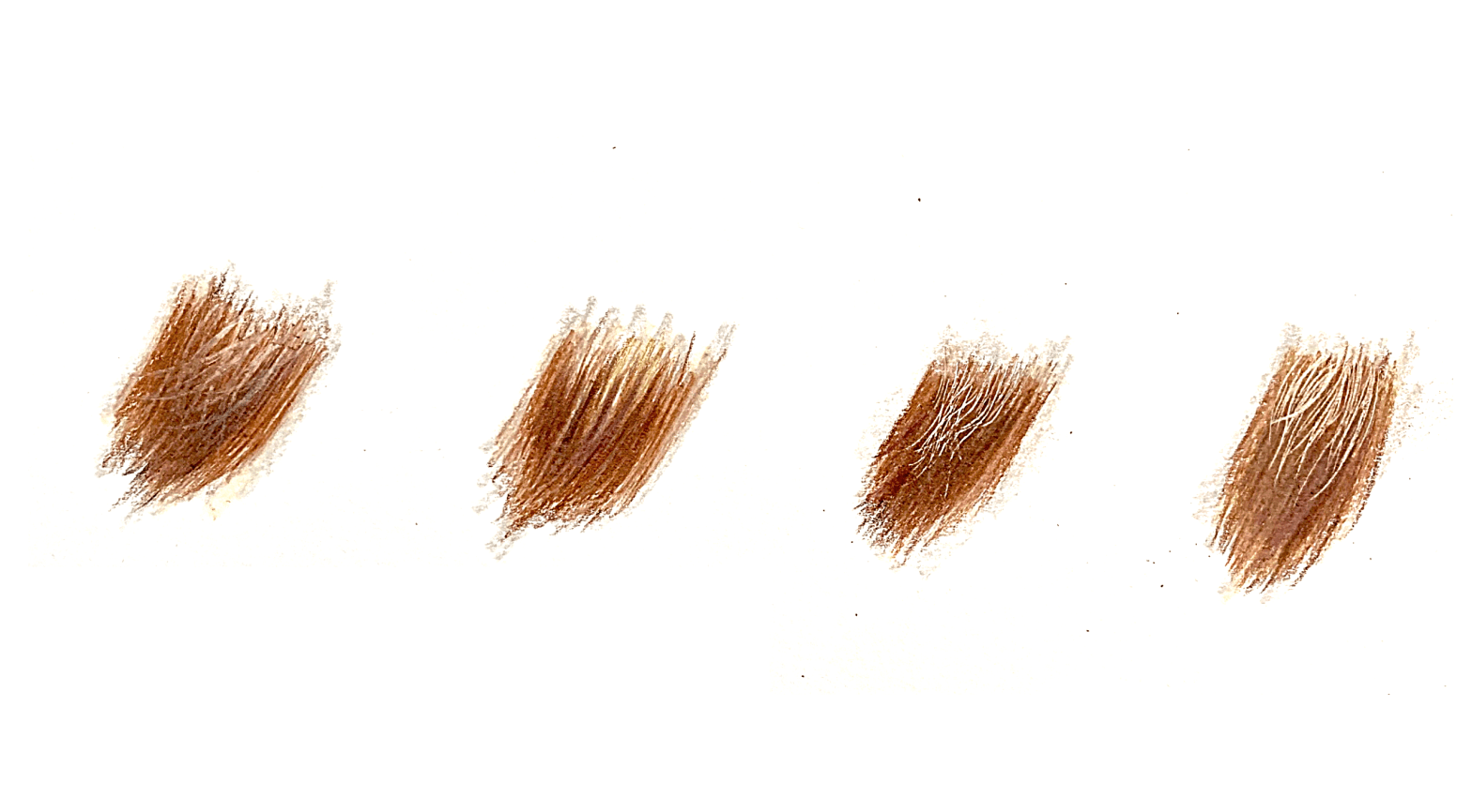
One of the hardest parts about drawing in coloured pencil is how difficult it is to use a lighter pencil on top of a dark one. Though you can to a certain extent, I’ve found I don’t get the nice crisp, clean lines I’m looking for. I thought today I’d share some of the techniques I use to get those detailed fine hairs in my coloured pencil drawings.

Draw on top

This can work for softer lines or out of focus fur, and depends a lot on the texture of your paper. I tend to really fill in the tooth of my paper, so often time lighter pencils don’t have a lot of paper for the pigment to grip onto when I’m at the last stages of a drawing. But I do use this to lighten areas of a drawing, like an eye or a nose. If you are using this for finer hairs, you want to make sure your pencils are really really sharp.

Draw around them

This is the hardest method, and is very time consuming. Basically, you just don’t colour in the area that has the lighter, fine hairs. This requires a ton of patience and time, and in my experience, doesn’t look all that good. This is primarily because if you’re doing your best to avoid drawing on top of a little wispy hair, it’s very hard to keep your dark strokes going in the direction of the fur – it’s easier to outline the little hairs, but that makes the fur beneath not look as good. I’m sure there are artist out there who can do this really well, I’m just not one of them. I use this technique for bigger clumps of fur, or if the lighter hairs are going in the same direction as the darker ones.

Indent

This is a good one, though I’ve been using it less and less lately. Using a small tool, press down onto your paper, and make whatever mark you’re looking for. I usually use this for whiskers or fine hairs in a coat. Once you’ve applied the stroke, you can colour over the line and the indents will show through. Best of all, you don’t need anything fancy for this technique — I actually use the metal point of a mechanical pencil. You do want to make sure you’re not using a tool that could get caught and rip your paper. For different coloured lines, you can put a base layer on the paper and then indent, preserving the colours you’ve put down. 

Slice Tool

This has become my new favourite technique. Slice tools are ceramic knives which you can order online from a bunch of different places. The blades, when used gently, scrape pigment off the paper without damaging the paper itself. This is great when you’ve added lots of layers, as you can take off just the top layers to reveal the colour underneath. It’s a great tool, I highly recommend it!

A very quick and rough demonstration of the four techniques from this post – overlay, drawing around, indenting and slice tool.

What techniques do you use to draw fine hairs in coloured pencil? Share in the comments!

Getting Started with Coloured Pencils

I’ve seen a lot of posts online lately asking how to get started with coloured pencils, so I thought I’d share some of my thoughts. I started using coloured pencils a few years ago, and I was terrible at it. I’d only really done watercolour and ink up until that point, and had no concept of layering, which is one of the key skills needed to master coloured pencils. Below are some of my tips for those just getting started with coloured pencils.  

Get good materials

Having good coloured pencils isn’t everything, but it certainly helps. My first artist-grade pencils were Prismacolor Primier pencils, and I was so excited to get them! I was brand new to coloured pencils, and thought Prismacolors were the best quality pencils you could get (oh how wrong I was!). I also had no idea what paper to use, which didn’t help. 

My current collection of Faber Castell Polychromos coloured pencils. I’ve built this up over time, buying colours as I need them, instead of purchasing a big set.

I recommend Prismacolors for beginners because they’re reasonably cheap, they’re easy to blend and have great pigments. They suffer in some other categories, but for most beginners, lightfastness isn’t much of a concern. I use mine on Strathmore Mixed Media or Bristol Vellum paper. I want to try and work up to using coloured pencils on Pastelmat, but it’s quite expensive and the smoother papers are much easier for those just starting out. 

Don’t go crazy 

I bought a set of 150 Prismacolor pencils as my first artists set. Having a broad range of colours was amazing, but really not necessary. I don’t use a lot of the colours, and now that I’m working with a smaller set of Faber Castell Polychromos pencils, I find there’s rarely a colour I can’t make by layering multiple pencils. 

I suggest starting with a small set and experimenting, to save you costs (and space!). Prismacolor and Faber Castell pencils are both available to buy individually, so if I ever run low on a pencil or need a new colour, I can just buy that one. 

Get a blending medium

If you’re like me and want your coloured pencil drawings to look smooth and realistic, with none of the paper showing through, I suggest getting some kind of blending medium. I don’t often use mine anymore, but when I was first starting blenders were a lifesaver! 

One of my first coloured pencil drawings. It’s a nice start, but I had no idea where to go from here and I definitely picked an overcomplicated subject, and left a lot of paper showing through on the springhare’s light parts.

If you have Prismacolor pencils, the Prismacolor clear marker is great for smoothing out lines and covering the tooth of the paper. 

Cover all your drawing

One of my ‘Aha!’ moments when I was first starting out was when I started filling in all parts of my drawing, not just the darker parts. So even if my paper is white, I still go over a white part of the drawing with pencil, and usually add in some other colours in there. This helps keep the drawing looking uniform and complete. 

Start Small

One of my first attempts at a coloured pencil drawing was of a springhare, a rabbit-like rodent. I had mostly drawn pets up to that point, so I thought fur would be fairly simple. It wasn’t, and the drawing did not go well. I put away my pencils in disgust. 

My pill bug drawing – this was the first time I really understood layering, and the individual segments of the bug really helped me focus on one part at a time.

A few weeks later I decided to do a smaller drawing, a pill bug curled into a ball. This drawing was the turning point for me, and it was when I discovered how to layer. I love drawing insects — they are naturally segmented which means you can focus on one small section at a time. That was huge for me. 

You don’t have to start out drawing insects, but I suggest picking subjects that are reasonably simple and are easy to break up into sections. It’s a good plan to learn how to use the pencils before tackling something complicated like fur. 

Don’t give up!

Just like any new skill, coloured pencils take time to master. I thought as soon my new pencils came in the mail I would be able to do amazing works of art like those I was seeing online. But I had no clue how to use them, and was very disappointed in my first few drawings. Over time I developed techniques like layering, blending, burnishing and indenting that helped me get to where I am today. There’s still lots I want to learn, but I can’t believe how far I’ve come. 

I’ve definitely improved over time – this is a 20×30 inch coloured pencil drawing I completed a few years ago.

Horsing Around

Last year I did a series of three horse portraits for the foyer of my new house, and I’m really excited about how they turned out! Though I have been involved in the horse world since I was 10, and owned horses since I was twelve, I had yet to draw a full-colour horse portrait since becoming a professional artist, but I was eager to try.  I thought I’d give you a bit of background on each of these portraits and then go into some things I learned along the way, so you can keep them in mind for your own art and learn a bit about my process!

I decided to start with Lewis, my most recent horse, simply because he was not grey. I have draw a lot of brown animals in coloured pencil so I figured I had a pretty good sense of what colours to use. Of course, Lewis’s coat was more than just brown: there were reds, yellows, creams and even purples in there. Once again I had to overcome my fear of putting in too much colour, as Lewis was always very uniquely coloured and I really wanted to capture that. 

Lewis

Lewis 

I was absolutely thrilled with how I managed to capture Lewis’s expression and colour, but then I had a more challenging problem: drawing two grey horses on white paper. Not to mention both horses were different types of grey (one dappled and one flea-bitten), and I really wanted to capture those differences as well. 

Lily

Lily

I drew Lily next, as she is the darker of the two, and I thought it would give me a fighting chance on figuring out how to make grey horses stand out on a white background. The biggest difficulty in this one was trying not to make her look too shaggy, as the reference wasn’t super clear in parts. It was also a little tough for me to draw emotionally, as I sold Lily when I went to university and still miss her a ton. Her show name (Adlaya) is now the name of my business, so I’m not lying when I say she means a lot to me. 

Levi

Levi 

Levi was last on the list. My first horse, Levi was a not-quite-pony who excelled in the jumper ring, won everything that he wanted to, and was a ton of fun to ride. I have lots of brilliant pictures of him, but I wanted it to be similar to the headshots of Lewis and Lily (since they’ll be hanging in the same room), with a bridle and nothing else. Unfortunately the only shot I had of him like this was not in the best lighting, and somewhat fuzzy. So I was quite worried about how this one would turn out. Thankfully, I saved him for last, which meant I had all the practice from Lewis and Lily to help guide me, and I was able to make a portrait I was very happy with! 

Takeaways 

1) Horse hair is short. Especially in working horses, when we clip their coats in the winter, their hair is quite short. You want to keep your pencil strokes the length of the fur your drawing, so with horses, short strokes are the ticket

2) Don’t be afraid to use colour. Even if it seems weird, or too much. I used a ton of colours that were not brown or grey in both portraits, and it adds so much depth and life to your drawings 

3) On a similar note, white (or grey) fur is never white or grey. I used so much blue in Lily and Levi’s portraits, to the point where I was sure I would overdo it. But every time I’d come back to the drawing table I’d add more, and I’m glad I did. 

4) Always cover every part of your drawing with pencil, even the truly white parts. Except for the background, I don’t let any paper show through on my drawings. It really helps the drawing stand out, especially if you’re working with grey colours on light paper. 

5) You can adjust the reference photo. I changed something in every one of these photos. Both Lewis and Levi had saddles on that were distracting, so I just took them out. Lily had a strap loose on her bridle so I just took that out. I increased the reflection in Levi’s eye because the reference was taken at night and the reflection of the flash made it look really weird. For Lily and Levi I added some warm shadows on the lit parts of their faces so they stood out against the white background. It worked. I’m happy. 

6) Adjusting references is hard, and it takes practice. If I tried to do these portraits even a year ago I wouldn’t have had the skills to make those adjustments, and would have just stuck exactly to what I saw in the picture. But with practice comes the ability to be more flexible and make necessary adjustments that make your portrait stand out. 

7) I love drawing horses. I will definitely draw more in the future! 

Picking References: Part Two

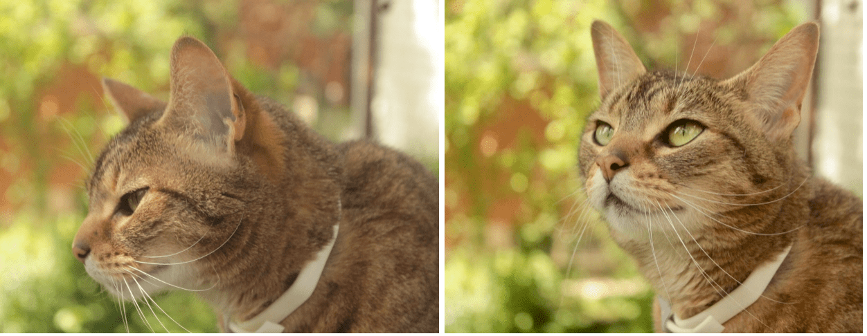
Last week I wrote a post about where to find reference photos to draw from. This week we’re going to continue that topic, but we’re going to focus on what to look for in a good reference photo. 

This is a drawing from one of those reference photos that I saw and just knew I had to draw – I love the bright colours of the anemone and the contrast. Reference by Stephen Bullock from Wildlife Reference Photos

Everyone is different and has different styles of drawing, so what you look for may be slightly different than what I do. It’s important to pick a reference that is suitable for what you like to draw. I tend to draw hyper-realistic close ups of wildlife, so that’s what I look for. This may seem obvious, but I’ve seen a lot of beautiful references that I know I’ll never draw because they are whole-animal, scenic shots. 

Make sure there’s enough detail. Unless you’re really skilled at drawing that particular animal, if there’s too much detail missing you’re going to have a lot of trouble filling it in. Save yourself a headache right from the start by picking a reference that has a lot of detail. 

Don’t be afraid to combine references. If you’ve found the perfect reference of one animal but need to know what it’s foot looks like, find some pictures of its feet! This is what I did for my Bug and Birthstones series, because it’s a little challenging to find actual pictures of bugs sitting on birthstones. Just remember that light sources differ from reference to reference, so try and find ones that have similar sources, or remember to change that source in the drawing. 

Don’t worry too much about composition. Although many great reference photos have wonderful composition, there are those that have nice parts, but the photo as a whole is not the greatest. As an artist, we have the flexibility of being able to adjust the composition of our piece to make it exactly the way we want.

Though both these pictures aren’t bad references, I love the way Tiiah’s eyes look in the second picture – seeing this picture really makes me want to draw it!

Finally, pick references that really make you want to draw them. If the reference is ‘okay’ but not ‘great!’, you’re much more likely to work on different projects and push that one back. Whether it’s the challenge of a new animal, the way the light hits the nose just right, or the brilliant colours, make sure you really like the references your choosing.  

When I’m looking for a reference photo, I browse a lot of photos until I find one I like. Though the criteria above are important, often I’ll see the photo and know I have to draw it. Have fun picking your own reference photos, and I hope these guides have helped you! You can read all about where to find reference photos in Part One of this series!

Picking References: Part One

One of the most important things for any artist is finding good reference photos to work from. Although I’ve gotten much better at drawing things from my head, for any detailed work I have to have a picture to base my drawing on. 

When I’m drawing someone’s pet, the client sends me the photo they want me to draw, so things are pretty simple. But when I’m drawing wildlife, I have a lot more flexility about picking a photo to work from. Which leads me to this post: where to get reference photos from. In a later post I’ll talk about what to look for in a reference photo, but for today I’m just going to talk about the different sources you can use as an artist. 

One of the important things to think about when sourcing a reference photo is to think about copyrights. Though it’s very easy these days to Google whatever subject and find hundreds of beautiful pictures, many of those will be protected by copyright law. When I first started drawing I didn’t pay so much attention to this, but back then I was drawing for fun and not for profit. Now that I sell my works, I’m much more careful about where I source my references from. 

A photo I took of a flamingo at the Toronto Zoo. I haven’t drawn this one yet, but it’s a decent enough reference that I could use it.

The easiest way to avoid any issues of copyright is to use your own references. Visits to the zoo or aquarium can be a good way to get pictures of wildlife that may not live in your area. Of course, not all of us are talented photographers, or we may not have the equipment needed to take quality close-ups. In that case, we need to look to other resources. 

There are a number of good free resources out there. Pixabay and Wikipedia are both good ones. Almost all the pictures on Wikipedia are under Creative Commons licensing, meaning the photo can be used for commercial purposes, so as you attribute the author, and as long as that product is also licensed under Creative Commons. Wikipedia has millions of photos, and if you can’t find one you like, you can look at Wikimedia Commons to find even more pictures. It’s a great resource! Just be sure you carefully read all the copyright and attribution rules.

Another fantastic place to look for free photos is in artist communities. I’m a member of a number of different Facebook groups that are specifically for artist reference photos – just make sure the group rules are clear and you can use the reference for commercial use. You also want to double check what accreditation is required for using the photo as a reference. 

A comparison of a reference photo and drawing of an elephant commission. The reference is by Charmaine Joubert, from Wildlife Reference Photos

The last place I look for references (and this is my favourite) is Wildlife Reference Photos, a website where you can purchase photos to use as references. While paying for photos adds to the cost of making a piece, Wildlife Reference Photos has some advantages: 

a) the photos are relatively cheap, at $5 per photo or $10 for five photos, with unlimited usage

B) once you purchase a photo, you can use it as many times as you like, for commercial purposes, even without accrediting the photographer (though it’s always nice to do so)

C) the site is curated, so each photo is reviewed before it is put on the site. This means the quality of the photos is often much, much better than what you’d find on other sites. 

D) you’re supporting other artists and photographers by paying a small fee for the picture. 

Those are the main ways I find references for my art, so go check them out! If you have a place you find references that I have mentioned, please share! 

Making Time for Art

If you want to get better at art, you have to practice. One of the reasons my art has gotten much better over the past few years is that I draw almost every day. The trouble is, very few of us can afford to be full time artists, so how do make time to practice? This post is going to talk about some of my strategies for getting art done every day. Some of them may work for you and some not. Hopefully they’ll at least help a little! 

I think I’ve improved a bit over the years! The secret… lots of practice!

1) Make it a habit

If you can set aside each day to work on some art, especially if you can do it at the same time, you’ll start to form a habit. You’ll find that at 9:30am you’ll start to automatically head to the drawing board, or get out your pencils, because that’s what you’ve done for the last three weeks. Personally, I start every weekday at 9:30am. Since I work from home, it’s easy to be lax about when I start, so setting alarms on my phone helps keep me on time. Even a short amount of time each day is useful, so try and fit it in if you can. 

2) Set limits 

In my opinion, it’s much better to draw for an hour each day than draw for seven hours straight. Even if you’re ‘in the zone’ and things are going well, you’re going to get tired, and when people are tired they get sloppy. I much prefer do a bit on a project each day and then coming back with fresh eyes. 

 It’s also much better for your mental and physical health to take breaks and set limits on your art time. I have a bad back, so I draw in one-hour chunks and take a half hour break in between. My schedule on weekdays is 9:30 to 10:30am, and 11:00 to 12:00pm. I start a one hour timer when I sit down so I don’t lose track of time, and once my hour’s up, I go do something active for half an hour, like physio exercises or walking the dog. 

3) Take time off

It’s okay to give yourself time off. For a self-employed artist, it’s pretty easy to take a day off whenever you need to. The tricky part here is balance; you if you take three days off every week, then you aren’t really drawing most days. But when I wake up with a migraine, or I’ve gone to a craft fair on the weekend, I give myself a day off and don’t beat myself up about it. We all need time off! 

I think looking back at old pieces to see your progress is so important!

4) Give something up

One of the biggest difficulties I faced when I first started my business was that I was working two jobs, and had a few occasional other jobs as well. When I added in the art business, I very quickly became overwhelmed with the amount I was doing. Basically, all of my free time went into completing commissions, and I had no time for fun stuff. 

I ended up quitting one of my jobs, not so I could do more art, but so I could do my art and be able to have some down time. You may be able to do everything for a little while, but that kind of thing isn’t sustainable. Don’t get me wrong — I’m not saying quit everything just to do art, but if you want to be serious about improving, you do have to make time for the art. And the thing you give up for your art shouldn’t be video games, reading, or your time at the gym. You need that down time for your mental health! 

Of course, if you have eight hours to spare every day, I’m sure you can fit in a few hours of art without having to give up too much! It’s all about balance. 

I hope these tips can give you a little bit of an idea of how to make time for practicing your art. Remember, even a little bit of practice most days of the week will make a big difference! 

But Everyone is so Much Better Than Me…

I am a very competitive person. I don’t often get upset when I lose, but I sure do like to win. I like to win at board games, at video games, and in sports. But I also like ‘winning’ in other aspects of my life: I always wanted to have the best grades in school, I want to be better at art than anybody else, and so on. In other words, I’m always striving to improve and I want to do my absolute best, which is not a bad thing.

But it can go a bit too far. And the truth is, there will always be somebody better than you. Unless you’re a world champion, someone will always beat you and will always be better. I came close to being the best in the world at something. It sounds impressive, but it’s really not. There was a stupid game on Shockwave.com that I played when I was a kid. It was called Mountain Bike Madness, and I played it obsessively. My scores were miles ahead of everyone else’s expect for one person. The two of us vied back and forth for that top spot for months, but he always edged me out. Then Mountain Bike Madness 2: Molten Mayhem came out, and I think he stopped playing, because I easily got the top scores in that game. So I guess I was the best in the world at something. Go me!

But outside of silly online computer games, I am definitely not the best in the world at anything. I’m good at things, maybe even great at some things, but there are certainly people out there who are better than me. And that’s hard for me, because I really do want to be the best. That’s where the problems come in — I have sometimes felt, because I will never be ‘the best’ at art (which is a silly concept anyway, but that’s how my brain works), maybe I should just give up.

It took me a little while to realize how pointless this way of thinking is, and to figure out how to overcome it. I follow a lot of amazing artists on Instagram, many of which produce works that are simply spectacular. And rather than look at those works and think ‘Well great, I’ll never be able to do that,’ I now think ‘Wow, someday I want to be able to do that!’. Don’t be discouraged, be inspired.

There’s something else to remember too: Yes, there will always be someone better than you, but by the same logic there will also always be someone worse. What I mean by that is there will always be someone who looks at your work and thinks ‘Wow, that’s amazing, I wish I could do that!’. And that can be a very important thing to remember when you’re not feeling great about your art.

So don’t give up — keep practicing, keep working, and you can get where you want to go. Keep striving to match that person whose art amazes and inspires you, and along the way you’ll inspire others.

And now that’s enough motivational advice for one day; I’m going to go take a nap.