One of the things I’ve noticed in my own work is that I tend to desaturate my subjects. By that I mean I make my portraits less vibrant and colourful than the references I’m working from. The reason for this is fairly simple: you can always add more colour, but it’s quite difficult to take away.
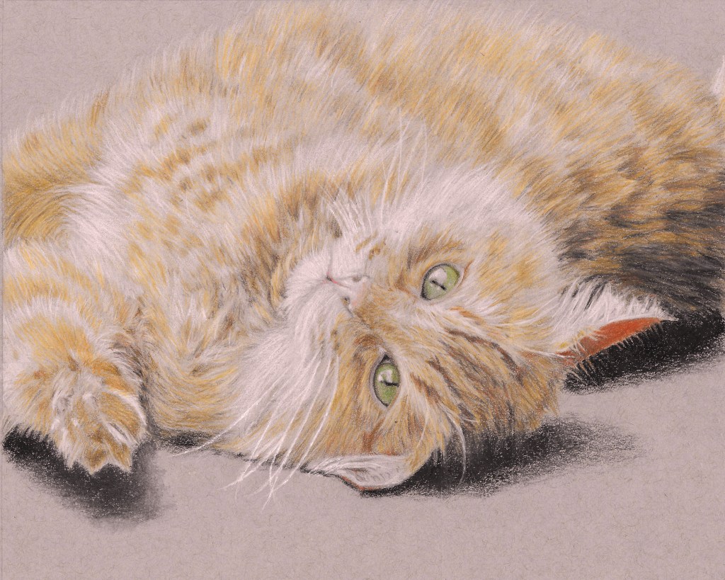
The colours I’ve noticed this the most with are reds and oranges, as demonstrated by my portraits of my family cat Blitz I did two years ago. He was a big, fluffy orange tabby, and though I really like my portrait of him, he was certainly more orange than the portrait shows.
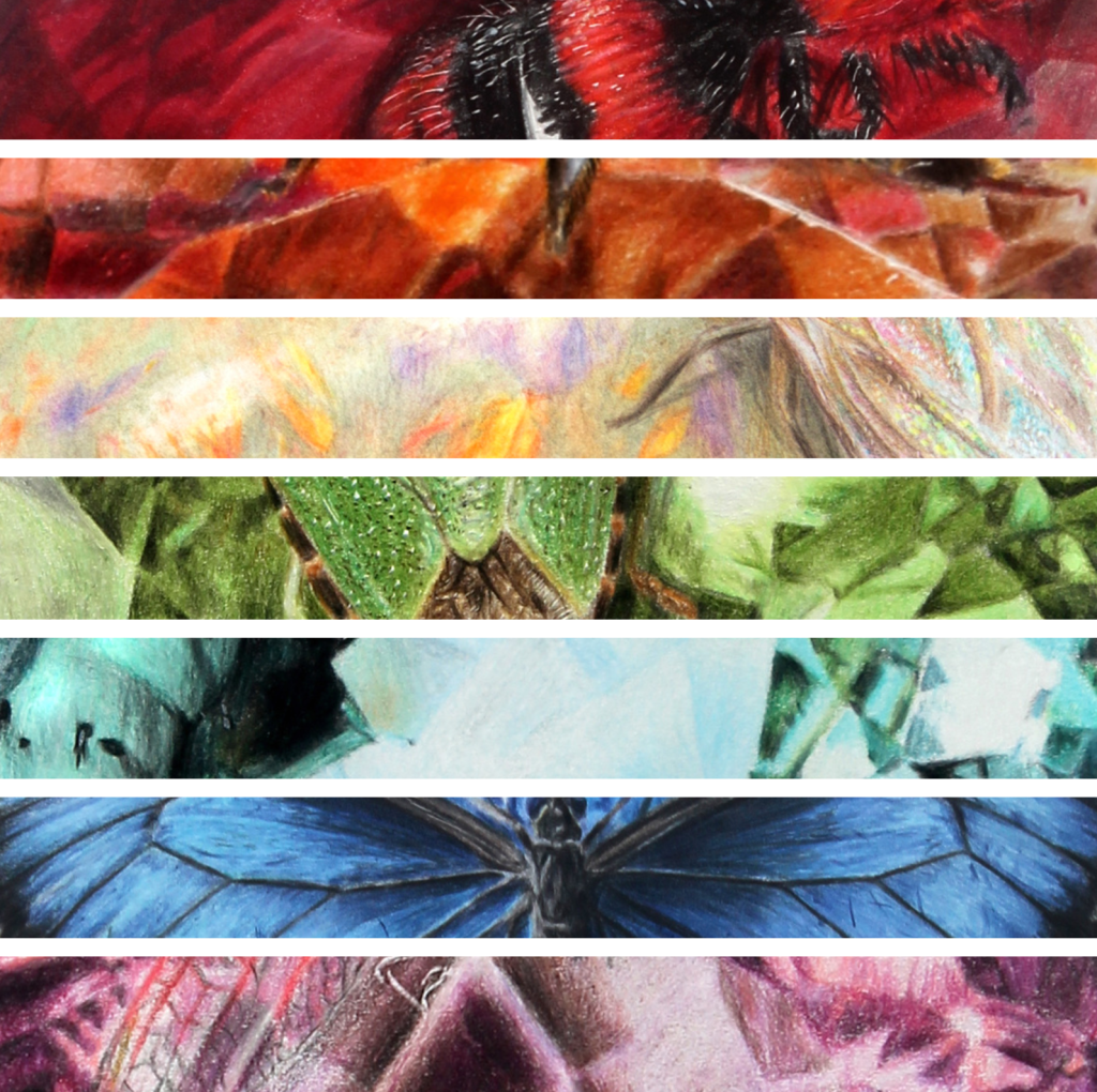
Lately I feel I’ve gotten much better with colour, and I’m not so afraid of adding it to a portrait. One of the main reasons for that is my Bugs and Birthstones series, which was all about colour. While working on that project I was forced to use lots of different colours, and I wanted the gemstones to be a bright and vibrant as possible. So I had to use a lot of colour, and since working on those I’ve noticed I add a lot more colour to my portraits.
Another thing that has helped is looking at other artists’ work online; I tend to like pieces that have deep colours, so that’s what I’ve tried to bring to my own work. Social media is a wonderful place to look at other people’s work and learn what you like about a piece and what you don’t. One of my favourite artists is Paul Hinks – he’s a master of adding rich, vibrant colours to his portraits. Though I’m not there yet with my own work, I’d love to be able to work towards that kind of usage of colour. I think it’s stunning.
The third thing that’s helped me bring more colour into my portraits is practice. I’ve drawn a ton in the last three years, and with that extra practice has come more confidence. I’m now much happier with how I’m using colour in my art, and I’m no longer so afraid to include deep, rich colours in my work.
Why is this important? First of all, when you develop your eye, you’ll start to see more and more colours in pictures or live subjects. I remember taking pictures of a client’s horse and saying: “Oh, he’s got some purple there.” My client was flabbergasted. Animals and objects are rarely just one colour – blacks have shades of blues, purples and reds, whites can be blue, pink, purple, green and more. Learning to see those colours and not being afraid of bringing them to the forefront of your art adds realism and depth to your portraits.
Every artist has things they can improve on, and there’s definitely more I can learn. Still, I’m making progress, and that’s the most important thing!
